The real question: why was one font easier to read, and why only for men?
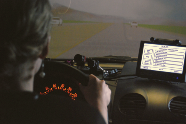
 Researchers at MIT's Age Lab have discovered that the fonts car manufacturers choose for use with in-dash entertainment systems can impact the amount of time drivers spend distracted behind the wheel. Unlike the physical controls found in older cars (dials, knobs, etc.), a rise in digital user interfaces has had the unfortunate side effect of demanding more attention from drivers. The study involved a simulation in which participants were asked to perform routine tasks on a display not unlike those you'll find in many modern vehicles. Researchers tracked eye movements during each session and tested two typefaces on the screen: the first was Eurostyle, with Frutiger serving as the second and more "humanist" font.
Study reveals fonts used by car manufacturers can influence distracted driving
 Researchers at MIT's Age Lab have discovered that the fonts car manufacturers choose for use with in-dash entertainment systems can impact the amount of time drivers spend distracted behind the wheel. Unlike the physical controls found in older cars (dials, knobs, etc.), a rise in digital user interfaces has had the unfortunate side effect of demanding more attention from drivers. The study involved a simulation in which participants were asked to perform routine tasks on a display not unlike those you'll find in many modern vehicles. Researchers tracked eye movements during each session and tested two typefaces on the screen: the first was Eurostyle, with Frutiger serving as the second and more "humanist" font.