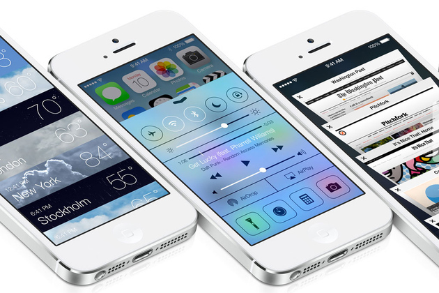
Different, but better? Nice function, but the look echoes others. The experience doesn't seem that unique, aside from the layering with parallax.
// published on The Verge - All Posts // visit site
Apple publishes transition guide to ease developers onto iOS 7

iOS 7 represents the biggest change to Apple's design principles since the original iPhone, the company said — and that means lots of work for the developers who want their apps to look native on the platform. To that end, Apple published a user interface transition guide for iOS developers today, TechCrunch reports.
The guide, which is available only to members of Apple's developer program, walks designers through iOS 7 changes including edge-to-edge layouts, translucent menu and status bars, and buttons without borders. It also describes the three core themes of iOS 7. Those themes, as quoted by TechCrunch:
Deference. The UI helps users understand and interact with the content, but never competes with it.
Clarity. Text is...